
The folks at Kanlaya Thai Cuisine have had enough. Any fans of either spot?

740 6th Street, NW


Dear PoPville,
Does anyone know why they replaced some of the the street signs on Sherman Ave and intersecting streets with really small hard-to-read-font signs that only have writing on one side? These new signs are just awful and useless! You literally can’t read them until you are right up in front of them due to tiny lower-case font, and if you are coming from the opposite direction of the writing of the sign, you’re S.O.L in knowing what street you are about to intersect! Also, why did they change some, but not all of the signs? Why did they replace the signs at all? I’m sure the old signs could have been reused!

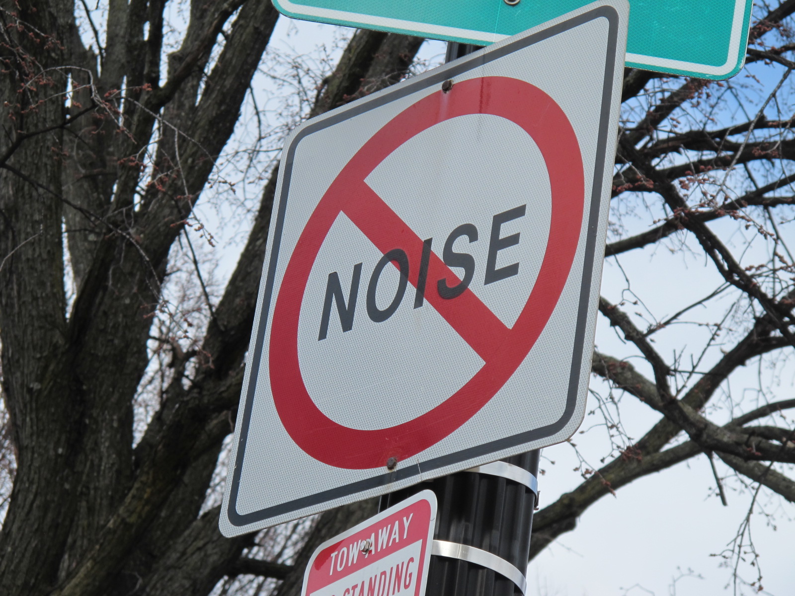
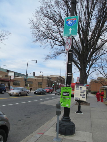
No Noise Zone on Georgia Avenue by Howard University Hospital.
Thanks to a reader for sending this one from 15th and U St, NW.

1901 18th Street, NW
Continuing to give props to stores that invest in proper signs instead of cheap banners – this week goes to Red Onion (records) at 1901 18th St, NW. Nicely done.


1400 block of Park Road, NW
Two years ago we noted that the completed Park Road facade improvement project looked awesome. I think it’s now time the ratty banner can be removed…


From upper Georgia Avenue.

5th and K St, NW
It’s fun to check out the evolution of the Louis’ Rogue signs at 5th and K St, NW.
I bet the neon one looked amazing when it worked:

I’m guessing this is the oldest:

And what do you think about this one, 70s or 80s:


From an alley off H Street, NE.


I love stumbling upon these old advertisements. This one is from Trinidad. Sadly this sweet carriage house is in some pretty rough shape. Hopefully it can still be saved one day.
