
These banners are double sided with green on one side and black on the other. Which do you like better these or the new ones from Adams Morgan? Personally I prefer the NoMa banners. Back in 2009 we looked at some other examples of neighborhood banners.

Recent Stories
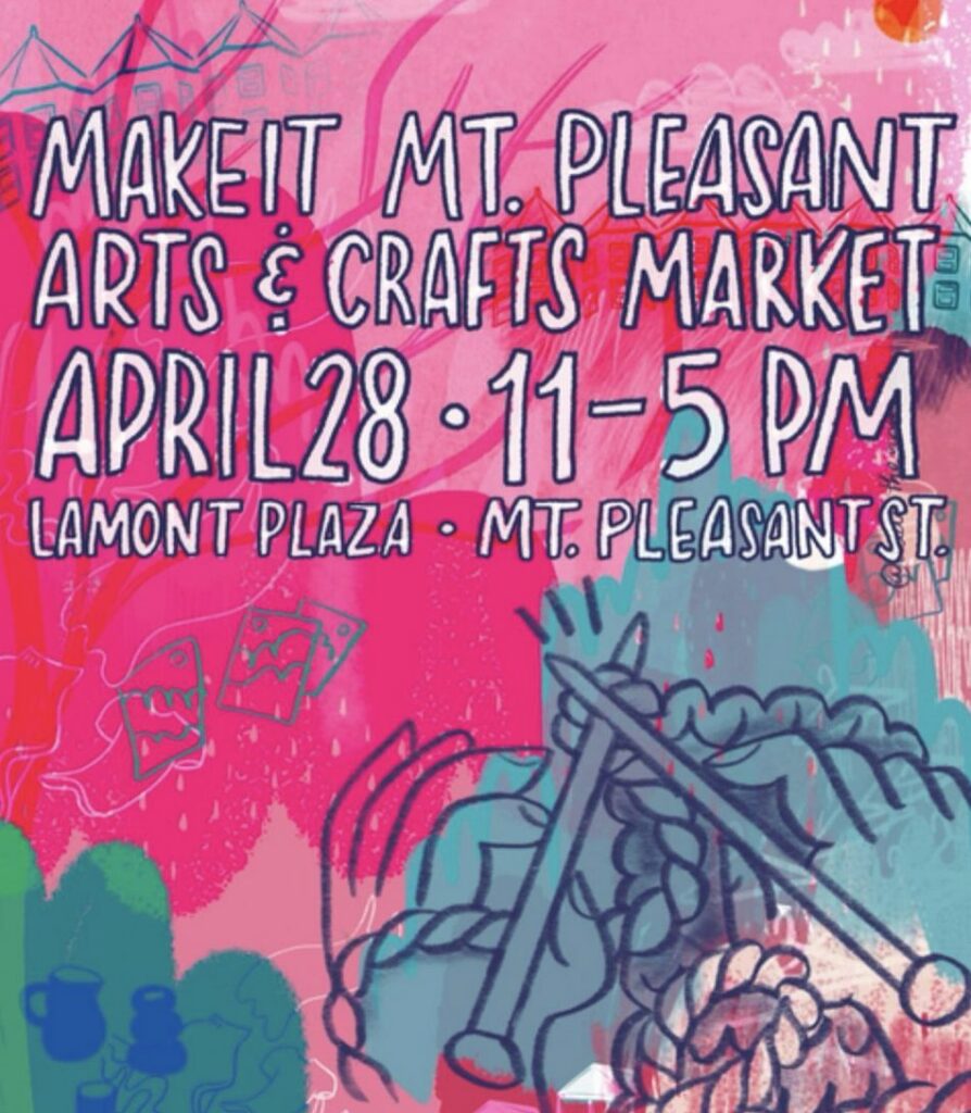
From an email: “We’re thrilled to host the Make It Mount Pleasant! Spring Arts and Crafts Market on Sunday, April 28! The market will feature more than 50 local artists…
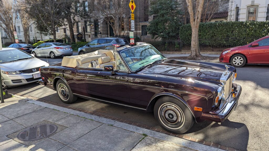
Thanks to Jeff for sending this beautiful convertible Rolls Royce Corniche II:
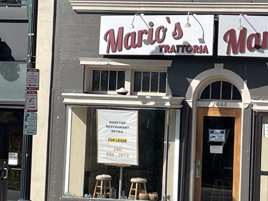
2444 Wisconsin Avenue, NW Mario’s Trattoria opened in the former Surfside space in Glover Park in 2022. Just noticed the sad sign in the window:
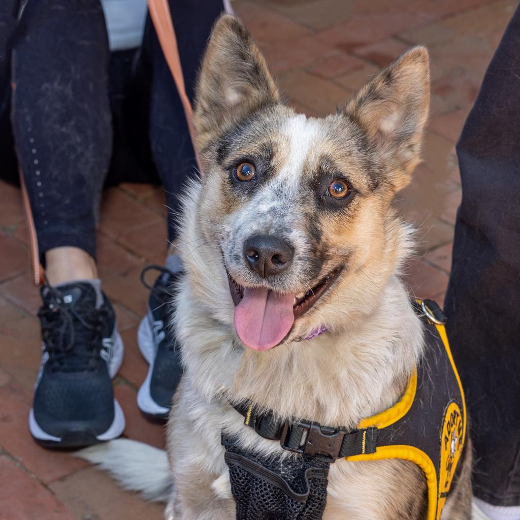
If you have any animal/pet photos you’d like to share please send an email to princeofpetworth(at)gmail(dot)com with ‘Animal Fix’ in the title and say the name of your pet and…

For many remote workers, a messy home is distracting.
You’re getting pulled into meetings, and your unread emails keep ticking up. But you can’t focus because pet hair tumbleweeds keep floating across the floor, your desk has a fine layer of dust and you keep your video off in meetings so no one sees the chaos behind you.
It’s no secret a dirty home is distracting and even adds stress to your life. And who has the energy to clean after work? That’s why it’s smart to enlist the help of professionals, like Well-Paid Maids.

Unlock Peace of Mind for Your Family! Join our FREE Estate Planning Webinar for Parents.
🗓️ Date: April 25, 2024
🕗 Time: 8:00 p.m.
Metropolitan Beer Trail Passport
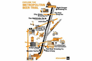
The Metropolitan Beer Trail free passport links 11 of Washington, DC’s most popular local craft breweries and bars. Starting on April 27 – December 31, 2024, Metropolitan Beer Trail passport holders will earn 100 points when checking in at the
DC Day of Archaeology Festival
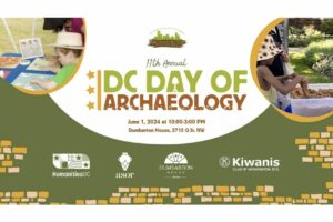
The annual DC Day of Archaeology Festival gathers archaeologists from Washington, DC, Maryland, and Virginia together to talk about our local history and heritage. Talk to archaeologists in person and learn more about archaeological science and the past of our