Ed. Note: Of course people can be critical about a design competition – though voting will take place in poll form next week – but if you are critical please show a little decency and don’t be rude about it. We’re just trying to have a little fun.
If you’d like to enter the U Street logo design competition, please send an email to princeofpetworth(at)gmail by the end of the day with your design and “neighborhood logo competition” in the subject line.

Logo by Mike Fogel
“I’m a freelancer who’s always looking for new projects. Had some time off yesterday and thought it’d be more fun to work on this than browse craigslist for the thousandth time! Happy to hear anyone’s feedback.”

Logo by Kiah G.
“I like my logo because it is simple, classic, and clean, and I think it will look nice on a T shirt.”
![]()
Logo by Tom Haskard
“Having lived near U St for the past year, the area to me reminds me of the music I’ve heard here, be it at 9:30 Club, U St Music Hall or any of the jazz bars. The beamed notes combined with the slur to combine a U shape.”

Logo by anonymous

Logo by Emily Boyer
Continues after the jump.

Logo by Emily Boyer

Logo by Emily Boyer

Logo by Emily Boyer
Recent Stories
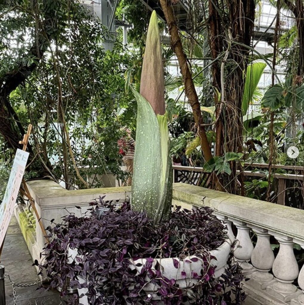
via U.S. Botanic Garden Exciting news from U.S. Botanic Garden: “Want to know more about the fabulously foul corpse flower (Amorphophallus titanum)? Drop by the back of the Tropics house…
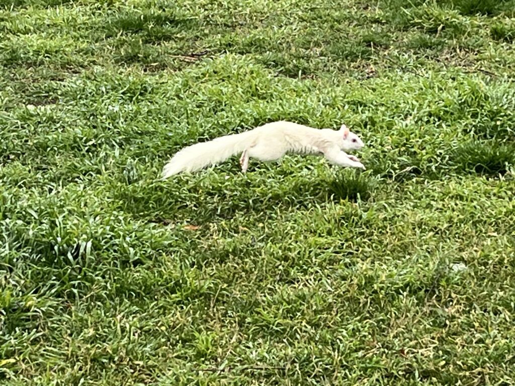
Thanks to Mark for sending from: “in front of the National Gallery of Art.”

Photo by Clif Burns Ed. Note: If this was you, please email [email protected] so I can put you in touch with OP. “Dear PoPville, Hey – you stopped me while…
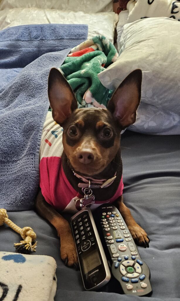
“Foxy Roxy staying warm and watching animal planet. Silver Spring” If you have any animal/pet photos you’d like to share please send an email to princeofpetworth(at)gmail(dot)com with ‘Animal Fix’ in…

Unlike our competitors, Well-Paid Maids doesn’t clean your home with harsh chemicals. Instead, we handpick cleaning products rated “safest” by the Environmental Working Group, the leading rating organization regarding product safety.
The reason is threefold.
First, using safe cleaning products ensures toxic chemicals won’t leak into waterways or harm wildlife if disposed of improperly.

Looking for something campy, ridiculous and totally fun!? Then pitch your tents and grab your pokers and come to DC’s ONLY Drag Brunch Bingo hosted by Tara Hoot at Whitlow’s! Tickets are only $10 and you can add bottomless drinks and tasty entrees. This month we’re featuring performances by the amazing Venus Valhalla and Mari Con Carne!
Get your tickets and come celebrate the fact that the rapture didn’t happen during the eclipse, darlings! We can’t wait to see you on Sunday, April 21 at 12:30!
Frank’s Favorites
Come celebrate and bid farewell to Frank Albinder in his final concert as Music Director of the Washington Men’s Camerata featuring a special program of his most cherished pieces for men’s chorus with works by Ron Jeffers, Peter Schickele, Amy
Cinco de Mayo Weekend @ Bryant Street Market
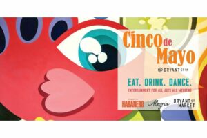
SAVE THE DATE for Northeast DC’s favorite Cinco de Mayo celebration at Bryant Street NE and Bryant Street Market!
Cinco de Mayo Weekend Line up:
Friday, May 3: