
625 Rhode Island Ave, NW
Lots of change since we last looked at 625 Rhode Island Ave, NW back in January. The architect is Suzane Reatig. Any fans?


Recent Stories
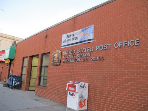
“Dear PoPville, I was feeling a little under the weather yesterday when I went to the post office at Kansas and Chillum. While at the counter things took a sudden…

Thanks to Patrick for sending our friend from the National Gallery of Art. Friends of the White Whale Society is brought to you by the team behind Hawks*** around Town….
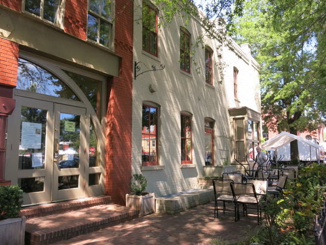
303 7th Street, SE Ed. Note: Almost exactly 8 years ago, then First Lady Michelle Obama visited Radici. Thanks to all who passed on the super sad news from Radici:…
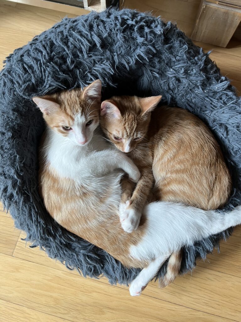
“Alfie & Wesley – Mount Vernon Triangle. They are both very polite and enjoy belly rubs as well as fish.” If you have any animal/pet photos you’d like to share…

For many remote workers, a messy home is distracting.
You’re getting pulled into meetings, and your unread emails keep ticking up. But you can’t focus because pet hair tumbleweeds keep floating across the floor, your desk has a fine layer of dust and you keep your video off in meetings so no one sees the chaos behind you.
It’s no secret a dirty home is distracting and even adds stress to your life. And who has the energy to clean after work? That’s why it’s smart to enlist the help of professionals, like Well-Paid Maids.

Unlock Peace of Mind for Your Family! Join our FREE Estate Planning Webinar for Parents.
🗓️ Date: April 25, 2024
🕗 Time: 8:00 p.m.
Metropolitan Beer Trail Passport

The Metropolitan Beer Trail free passport links 11 of Washington, DC’s most popular local craft breweries and bars. Starting on April 27 – December 31, 2024, Metropolitan Beer Trail passport holders will earn 100 points when checking in at the
DC Day of Archaeology Festival

The annual DC Day of Archaeology Festival gathers archaeologists from Washington, DC, Maryland, and Virginia together to talk about our local history and heritage. Talk to archaeologists in person and learn more about archaeological science and the past of our